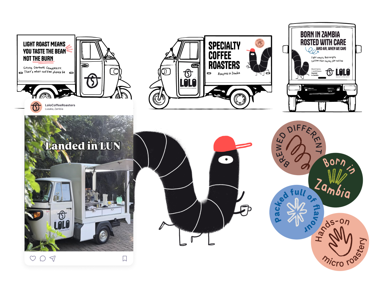
Lolo is a Zambian specialty coffee roaster on a mission to bring roasting, and pride in the bean back home.
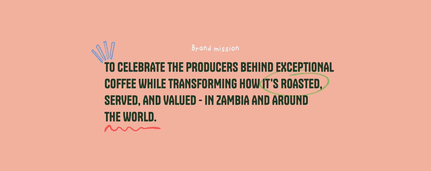
I worked with founder Mark to build a full brand identity. From mission and voice through to visual system, crafting a brand that's now live on packaging, at coffee fairs, and rolling through Lusaka on its own branded tuktuk.
The Brief
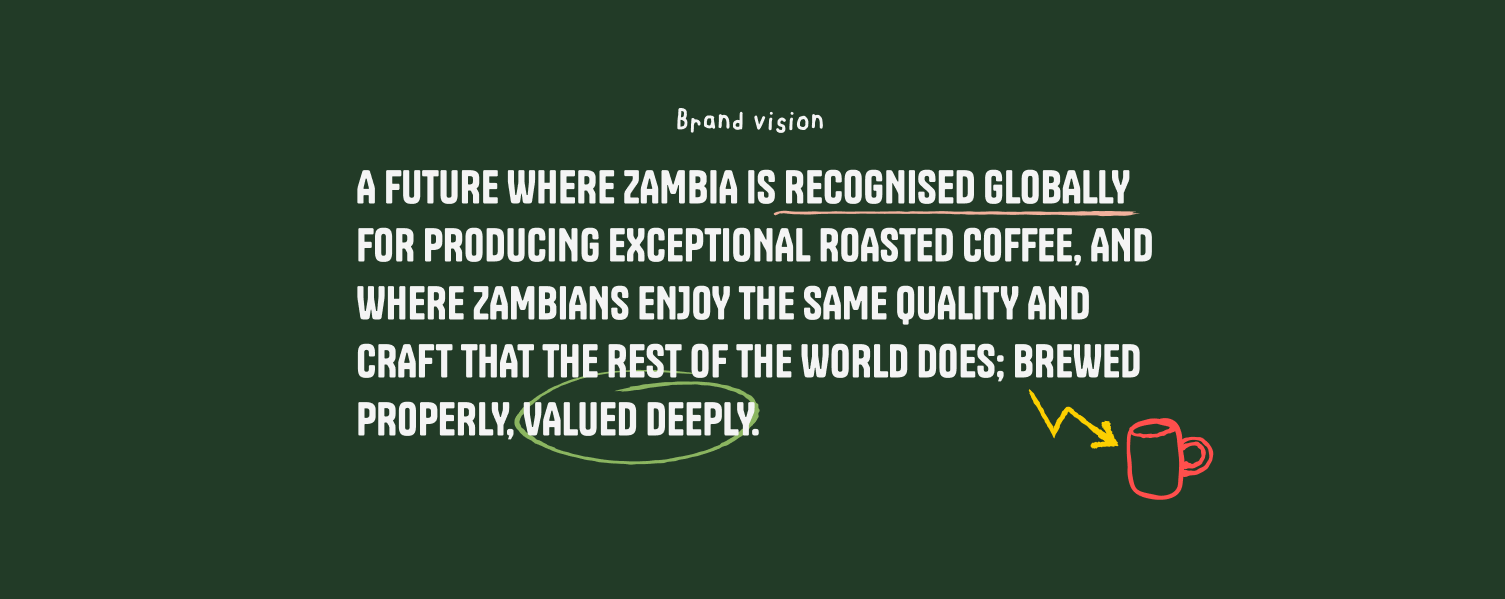
Mark had already been roasting and selling his coffee and wanted to upscale, starting with a tuktuk to travel round Lusaka. For this we worked together to create a solid foundation: mission, voice and visuals.
The approach
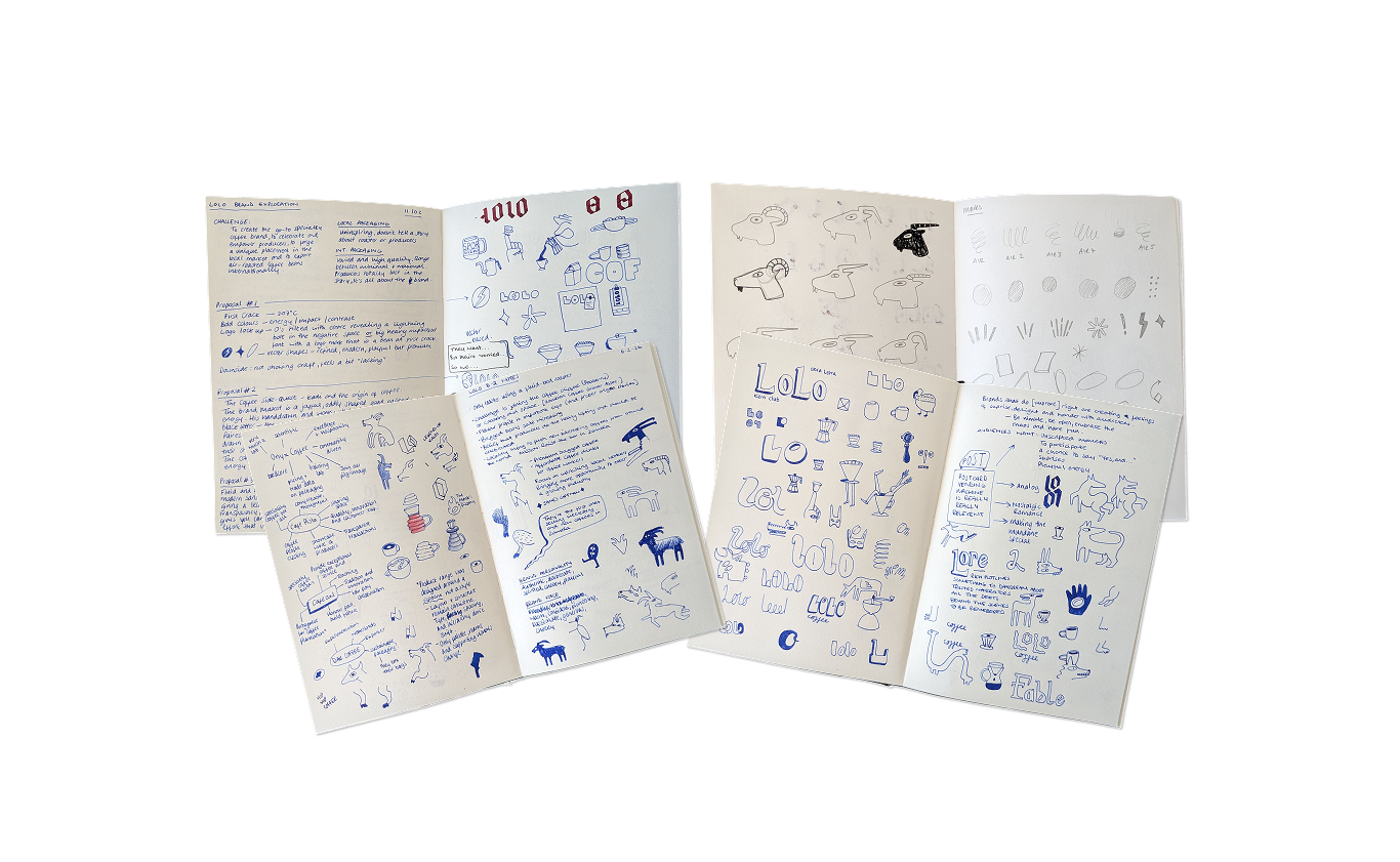
I started with a questionnaire, then built three moodboards from Mark's own words. Seeing them laid out helped us rule things out as much as in, landing on one final direction: crafted, irreverent, idiosyncratic, and grounded.
Finding the mark
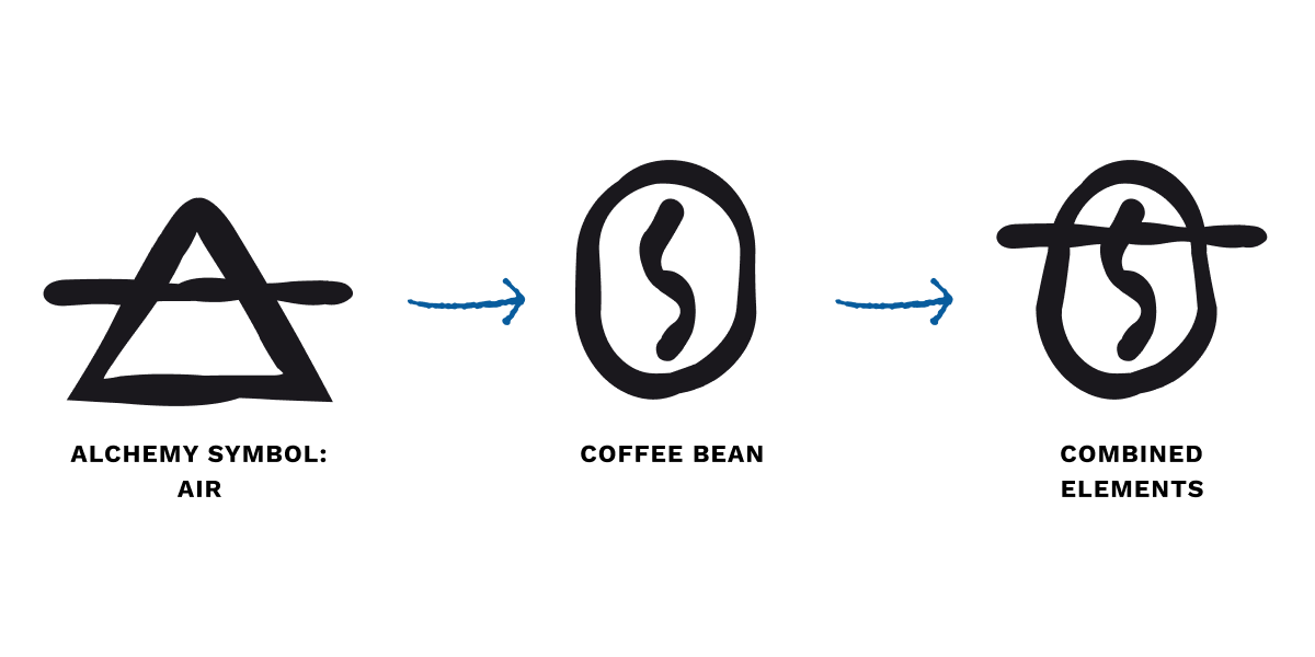
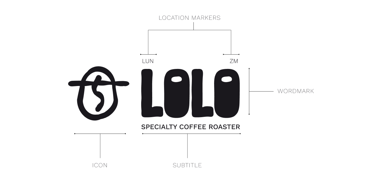
With scope this open, I explored three directions: Kadi the Goat, pulling on coffee folklore; a bold hand-drawn wordmark that ended up feeling a bit too "East London"; and an alchemy mark combining a coffee bean with an alchemical symbol. The alchemy mark won: clean, reproducible, and memorable in a way the other two weren't.
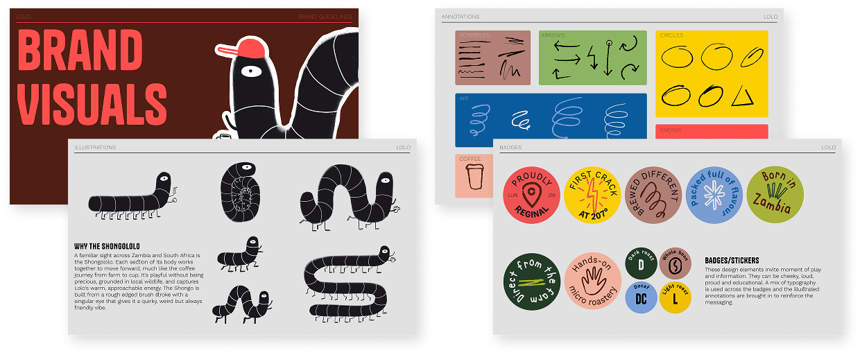
The Shongololo came at the same time, hand-drawn in my own style, sitting alongside the vector logo as a playful counterpoint.
The system
We landed on three fonts: Tanker for bold headlines and coffee names, immediate and attention-grabbing; KC Brendan Hand for storytelling and off-the-cuff humour; and Work Sans for clear, concise information. The primary colours are inspired by Zambia's landscape and commodities, supported by sharper, brighter tones for small pops of energy.
Out in the world
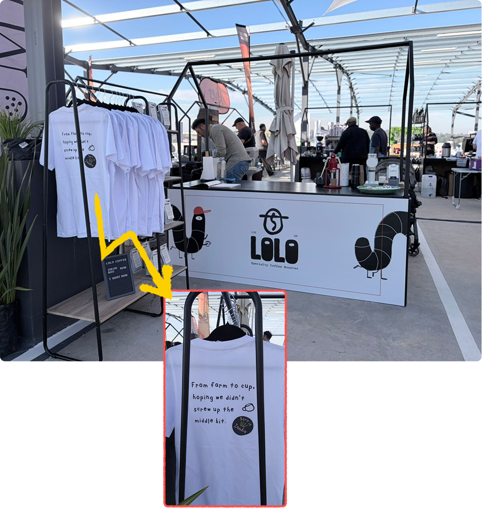
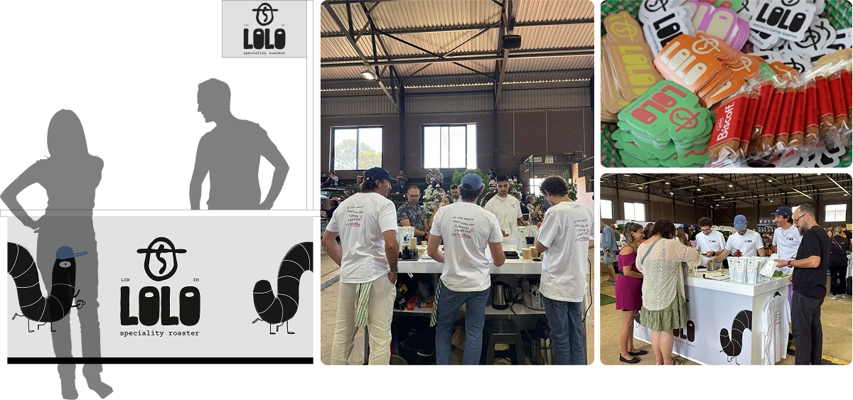
The brand went into practical use first through printed banners and labels at coffee fairs in South Africa, a first introduction to the new Lolo identity, well received. The tuktuk wrap was completed in Cape Town and has since made its journey to Lusaka, where it now serves fresh-brewed coffee and freshly roasted beans.